
Choosing colors straight from a digital picker or paint tube often leads to harsh visual clashes or dull, lifeless sludge. Many visual artists struggle to understand why a palette that looked radiant in their imagination turns into visual chaos on the canvas. Mastering color theory for visual artists is not about memorizing rigid academic formulas; it is about learning how value, temperature, and spatial contrast work together to direct the viewer’s gaze and evoke genuine mood.
When you control your color relationships intentionally, every brushstroke gains purpose. A single splash of accent red feels electric against a muted olive background, whereas that same red gets swallowed whole inside a chaotic rainbow. By learning how to balance harmony with strategic contrast, you can craft captivating palettes that carry emotional weight and visual clarity.
The Hidden Secret of Color: Value Does All the Work
Value measures the relative lightness or darkness of a hue, independent of its actual color identity. A common mistake among early creators is believing that vivid hues alone create focal punch. In practice, visual contrast is governed almost entirely by value relationships; color simply delivers the emotional flavor.
If you convert a poorly balanced painting to grayscale, the entire scene collapses into a uniform, unreadable gray soup. Establishing a clear value hierarchy—organizing your canvas into distinct foreground, midground, and background values—ensures your composition remains readable from across a room. Exploring foundational workflows through the best Domestika illustration courses
reveals that veteran painters always lock their black-and-white tonal studies before introducing color washes.
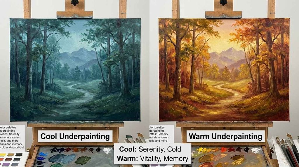
Once your values are stable, color temperature adds three-dimensional form. Warm light creates cool shadows, while cool ambient sky illumination casts warm shadows across crevices. This temperature shift gives painted objects volume and atmosphere without needing endless layers of hyper-saturated pigment.
4 Classic Harmony Models for Dynamic Palettes
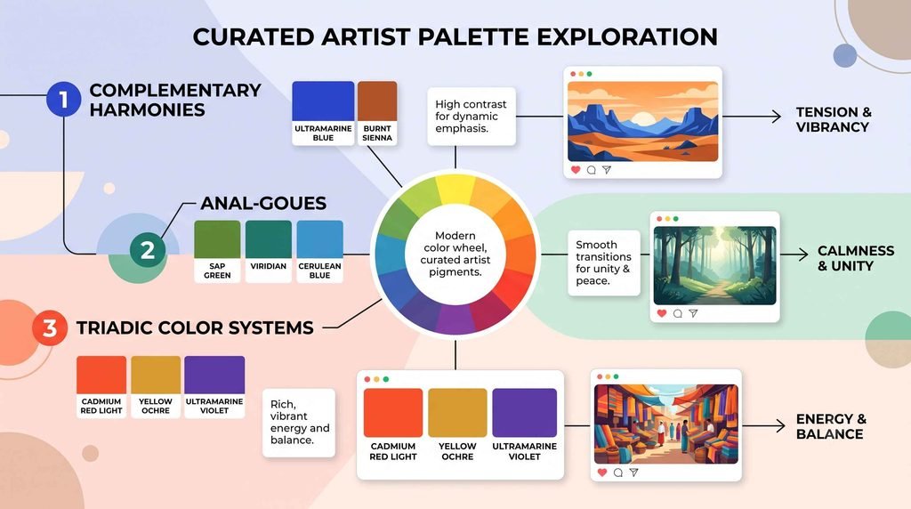
1. Complementary Contrast (Maximum Tension and Pop)
Complementary palettes pair hues sitting directly opposite each other on the color wheel, such as cyan and orange or yellow and violet. Because these wavelengths stimulate opposing visual cones in the human eye, placing them side-by-side produces vibrant optical vibration. To keep this energy from feeling jarring, designate one color as the dominant backdrop and use its complement strictly as a targeted focal accent.
2. Analogous Harmony (Atmospheric Unity and Serenity)
Analogous schemes utilize three to four colors that sit directly adjacent to one another on the wheel, such as cobalt, turquoise, and emerald green. Because these hues share common pigment foundations, they naturally evoke harmony, atmospheric calm, and visual unity. The risk here is visual monotony, which you can easily counter by varying the lightness and saturation across your neighboring hues.
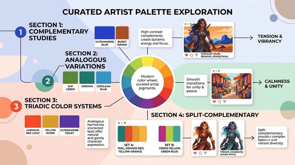
3. Split-Complementary (Controlled Complexity)
The split-complementary model pairs a base color with the two hues adjacent to its direct complement—such as pairing deep blue with golden yellow and red-orange. This approach retains the punchy focal pop of a classic complementary pairing while easing optical tension. It provides visual variety without the danger of muddy, conflicting mixtures.
4. Triadic Balances (Playful and Balanced Energy)
Triadic palettes draw three colors evenly spaced around the color wheel, forming an equilateral triangle like yellow, cyan, and magenta. This arrangement feels buoyant, vibrant, and energetic, making it a favorite for stylized fantasy art, comics, and editorial graphics. The key to triadic success is establishing an asymmetric hierarchy: let one hue dominate 60% of the canvas while the remaining two play supporting roles.
Comparing Palette Construction Models
| Harmony Model | Primary Visual Dynamic | Dominant Mood | Biggest Pitfall | Best Use Case |
| Monochromatic | Uniform tonal progression | Quiet, contemplative, stark | Can feel flat or boring | High-contrast concept art, noir scenes |
| Analogous | Seamless optical flow | Serene, cohesive, natural | Lacks an immediate focal punch | Environments, botanicals, background art |
| Complementary | High-energy optical friction | Dramatic, urgent, electric | Clashing edges if over-saturated | Action frames, hero focal points, posters |
| Split-Complementary | Balanced dynamic contrast | Nuanced, sophisticated | Requires careful saturation control | Character design, editorial spreads |
| Triadic | Vibrant geometric rhythm | Playful, rich, spirited | Muddy transitions if mixed carelessly | Animation design, children’s book art |
The 60-30-10 Rule: An Operational Blueprint for Balanced Color
[Check Value Structure in Grayscale] ➔ [Lock Dominant Base: 60%] ➔ [Introduce Secondary Support: 30%] ➔ [Place Accent Pop: 10%]
1. The Dominant Base (60%)
The dominant color acts as the anchor of your entire composition, establishing the underlying lighting condition and mood. This color usually occupies backgrounds, ambient shadow washes, and large planar masses. Keep this hue relatively desaturated so it does not overwhelm the composition before secondary elements arrive.
2. The Secondary Support (30%)
Your secondary color creates structural interest and supports the dominant hue. It should occupy about one-third of the active canvas, coloring key costumes, architecture, or environmental elements. Choose a color that creates gentle contrast with your base—either through an analogous temperature shift or a step down in value.
3. The Accent Pop (10%)
The remaining ten percent belongs entirely to your visual hero. This is where you deploy your most saturated, high-contrast hue to steer the viewer’s eye straight toward faces, critical props, or story climaxes. Because the surrounding 90% of the piece remains grounded, this small pop of pure saturation commands immediate authority. [EXTERNAL LINK PLACEHOLDER: Principles of simultaneous contrast and optical focus in visual perception]
Color Psychology and Temperature: Shaping Viewer Emotion
Colors bypass conscious thought to trigger immediate visceral reactions. Cold cobalt tones evoke isolation, discipline, and stillness, while fiery ochres and cadmiums communicate passion, urgency, and radiant vitality. Muted moss greens and desaturated umbers instantly anchor an illustration in grounded, tactile authenticity.
Context fundamentally dictates how an audience interprets a hue. A radiant crimson read against crisp white signifies vitality and medical hygiene, whereas that exact same crimson dripping across a murky charcoal corridor reads as pure terror. If you plan to isolate standalone character designs or design assets for clean merchandise mockups, learning how to use Canva’s AI background remover for clean graphics
provides an efficient way to extract your colored artwork onto diverse backgrounds to verify its impact.
If your creative ambitions expand into motion, understanding how lighting and color grading evolve over time becomes critical. Studying a comprehensive graphic design, video editing, and motion graphics masterclass
will help you discover how lighting curves and LUT adjustments carry color palettes across moving frames without breaking visual harmony.
Frequently Asked Questions
Why do my paint mixtures look muddy instead of vibrant?
Muddy colors happen when you mix hues from opposing sides of the color wheel that contain warm and cool biases, effectively introducing all three primary colors together. When pigments containing red, blue, and yellow blend haphazardly, they cancel each other out into desaturated brown-gray sludge. Mixing pure single-pigment paints or using digital layer blend modes like Color Dodge preserves chromatic luminance.
Is value really more important than color?
Yes. Human vision detects value and edge contrast through rod cells before registering color data through cone cells. If your underlying black-and-white values are correct, you can tint an illustration with bizarre neon palettes and the forms will still read as solid, believable dimensional objects.
How many colors should I include in a single palette?
Working with four to six core colors is ideal for maintaining visual control. Limiting your initial palette forces creative problem-solving and ensures your design maintains unified lighting conditions across complex compositions.
Command Your Color Choices
Great color control does not require an endless spectrum of pigments; it requires the discipline to make deliberate, restricted choices. When you allow values to build dimensional volume, use desaturated tones to create breathing room, and save high saturation for meaningful accents, your paintings will naturally command attention. Pick a single harmony model, block out your grayscale values, and build your next cohesive color palette with purpose today.
One thought on “Color Theory for Visual Artists: Building Harmonious Palettes That Pop”